American Express
Different markets have different audiences and different laws governing credit cards. I help uplift credit card applications of international markets like Japan, France, and Canada to help make it easier to apply for a credit card.

Client:
American Express
Team:
Design team of 2, Product owners and developers
Stakeholders:
Credit card applicants, local acquisition teams, downstream systems, sales agents
My role:
-
Gathering requirements from stakeholders from the local markets.
-
Identifying areas where research and analytics is required.
-
Re-designing existing applications.
-
Contributing to the team's design library/component library.
-
So far I have migrated around 8 applications in 5 markets.
Tools used: Sketch, InVision, Axure
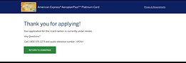
Confirmation Page - Redesign example
Duration: 2 weeks
Pain Points:
-
Customer care professionals had a high call volume because applicants didn't know where they would receive their cards in situations where we collect multiple addresses. Example - Business vs personal, primary vs add-on.
-
Doing a quick audit of existing thank you pages, I found that:
-
there was no consistency in the content
-
most of them were formatted as a wall of text
-
in the mobile view, the important information was hidden below the fold of the screen.
-


Process and changes made:
-
Worked with the UXR team to understand the mental model of the applicants at this stage - what information are they expecting? We found that they were looking for:
-
When is the card coming?
-
To what address is the card coming?
-
Will I get an email or do I need to write down the reference number?
-
-
Referred to previous research which showed applicants felt like adding their name adds a personal touch

What would I change?
-
Find a way to also show the card art perhaps with the applicant's name on it - in a way that makes sense for mobile. We have seen that to be a moment of delight in other aspects and I would like to try it here as well.
-
Conduct research in different markets, not just one, to see if the expectations are any different.
-
Continue to monitor customer care feedback to see if there are any other questions that come up.
Initiatives
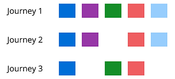
Set up user flows
Pain points:
-
We had 6 different user journeys with no proper documentation.
-
The teams were siloed and our team focused just on what was built by us.
Actions:
-
I documented journeys from the user's perspective and not just the team's perspective. It showed how our teams intersect.
-
This also provided a view of the technical dependencies.

Set up building blocks
Pain points:
-
Through the user flow documentation, I noticed blocks of journeys were repeated across other journeys. But in a new design, we weren't sure if any of it was done before which sometimes led to duplication of effort.
-
This caused inconsistencies between our journeys and also between journeys owned by other teams. We were using the same design system but putting it together in different ways.
Actions:
-
Following atomic design principles, I started documenting common blocks of design and where it was used so they can be referenced. This way we could :
-
Maintain consistency
-
Avoid rebuilding the wheel and make sure all scenarios are covered
-
Achieve tech reusability
-
HTML Prototypes with layouts
Pain point:
-
Again we saw that although the design system was used the layout implementations were different across journeys.
Action:
-
I created HTML prototypes of our journey and worked on a common layout to span all our breakpoints accurately.
-
It was also an easy way to hand off specs to the tech team.
Design process

Key Learnings
-
Working for markets with highly varied personas
-
How to work with and contribute to a well-established design system
-
How to incorporate accessibility into the design process
-
Understanding the workings of an enterprise product and how to connect the different portions of a huge product to maintain a consistent experience